
It’s time to stop thinking about technology as technology, but it’s hard to get people to do that. Users are either fascinated or fearful of new technologies, and these gut reactions make them blind to the ‘”why” of it. In this three-part series, I want to spend some time looking at how design telegraphs intention to users, how we can design technology environments (both hardware and software) to telegraph augmentation instead of fear and frustration, and how we can explicitly use more overt communications strategies to augment users’ ability to leverage technology for teaching, learning, and productivity.
When designing a learning environment that involves technology, there are a couple of guiding truths that are too often overlooked — first, the central element of effective technology is design; and second, the design employed is an implicit form of communication. Like a well-composed photograph, a well-thought-out design creates a pleasing and rewarding effect, but often the viewer can’t explain why. Architects and designers have an expression for this: “Design should be 99% invisible.” This applies as much to technology as any building, artwork, or piece of furniture. (This reference is from a great podcast “99% Invisible,” which I highly recommend to anyone interested in the topic of design in all of its applications.)
Unless you are a technician or technologist, the central function of technology should be as an invisible augmentation of the hard tasks we face every day. This is a difficult message to convey to both technology professionals and the average user because it requires an understanding of the importance of design in technology utilization. It also requires a fundamental reorientation of perspective on technology. You have to go far beyond the relatively simple bar of functionality to the much more complex bar of invisibility. In other words, technology should never be about technology; it should be about what it enables us to do.
To illustrate this approach, I often refer to my own unique experiences using technology. In 1999, long before I knew about Douglas Engelbart, I made the deliberate decision to leave the IT support field and took a serious pay cut to do so. At the time, I said that the reason that I was leaving was that I wanted to use technology, not be used by it. As a technology support person, you are a slave to the technology. Your existence is making sure it works, and your goals usually begin and end with the technology itself. As many of us know, getting away from this role is not as simple as walking away from it. Once people know you have a facility with computers, you automatically become tech support, whether that’s in your job description or not. Even as an instructional technologist, I’m constantly struggling to communicate to senior administrators that the primary role of my department is to support people, not technology.
My approach to computers has always been to look past them. I wanted to do things with them, not fiddle with them. The first BASIC program I wrote on the Apple ][+ was a routine that would resolve combat using the Dungeons and Dragons system. I was most interested in simplifying a real world (sort of) issue using the computer, rather than how to program. My approach to photography is similar. I want the camera to disappear so that I can focus on the image, which is a challenge.
As I like to say, it is only when the technology becomes invisible that true creativity can take place. My fixation with ends over means represents a critical distinction in how I approach technology that differs from the vast majority of the world. Again, technology doesn’t fascinate me. It’s what technology lets me (and those that I’m trying to help) do that truly fascinates me. I don’t care if the computer works. I care if the person is able to work, create, teach, etc. with it. Increasingly, I’ve found that the only way to achieve these lofty goals is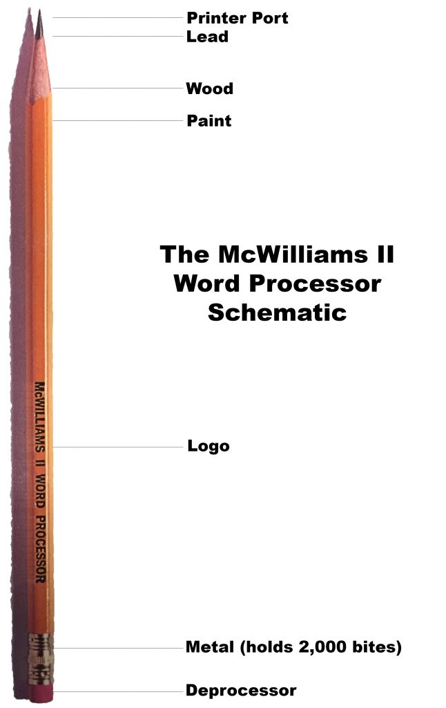 through good technology design.Every tool communicates to the user. A hammer says, “Beat something with me.” Even a two-year-old knows what to do with a pencil. He may not be able to write, but he can certainly scribble. These are natural interactions based on very functional design. Peter McWilliams illustrates this point through humor and reversing the simple to the complex in the now out-of-print McWilliams ][ Word Processer book.
The McWilliams book ironically demonstrates that when it comes to what we tend to think of as technological tools, too often the message sent by our modern tools is, “Be afraid, be very afraid” instead of “Imagine what I can help you do.” Bad technology design often gets in the way of this goal.
Combining functionality with good design is a rare trait in the technology world. This is often what sets Apple apart. Over its history, what has set Apple apart has been its unique ability to bring good design to existing technologies and make them wildly successful. There were PCs before the Apple ][+, there were mp3 players before the iPod, and there were even tablets and smartphones before the iPhone and iPad. By adding the touch of design to existing technology they made it accessible. This is a lesson we should take to heart as we design classrooms, software interfaces, and other technology spaces on our campuses.
About eight years ago, I was given a report on “ubiquitous computing.” At the time, it was considered to be the coming thing, but I completely failed to grasp its significance. To me, “ubiquitous technology” was about technology everywhere and on-demand. What I failed to see was that “everywhere” means that technology is integrated into space designs, not just tacked on. In order to achieve this, technology design has to be invisible. It should not be conspicuous, but instead quietly augment what we are doing to the point where it makes a new world possible.
In How Buildings Learn, Stewart Brand argues that even architects struggle with this concept. They build buildings as monuments to themselves instead of being concerned with the basic functionality of their use. He argues that the most effective buildings are the ones that can be infinitely reconfigured to meet the needs of their inhabitants. Technology should be viewed in exactly the same way. Rigid networks and computer security, rigid implementations of big technology are all inhibitors to the usage of the technology and the space in which it is placed. Classroom multimedia podiums are every bit as much as a monument to technologists as a Frank Gehry building is to architects.
The key is to bring together technical and non-technical people and help them understand the critical importance of good design in executing projects that involve technology. This is an ongoing challenge for my team and me. When I try to get this point across to the designers of our technology systems, they find it a hard concept to grasp. Most are not even designers in the traditional sense of the word. As a result, they are designing technology environments in purely functional terms and without regard to design. As a result, technology is, to the end user, ugly and inelegant. We will never achieve real technological adoption until we fix that.
Contents
The Essence of Good Design

A few months ago, I delivered a talk on “Idea Spaces” at the New Media Consortium Summer Conference in Portland. It was a concept I had been struggling with for quite some time. There were many disparate threads to connect, and it was challenging to find time for reflection. Like many things in my life, the talk came rushing up to me faster than I was ready to deal with, and my task to discern the coherent narrative amidst the complexity was on a tight deadline.
Fortunately, on my flight to the NMC Summer Conference, I had time to watch two excellent documentaries. The first was Tim’s Vermeer in which a Texas-based inventor, Tim Jenison, tries to replicate a 17th century Dutch masterpiece, and in the process, discovers an ingenious optical tool that Vermeer likely used to paint his photographic, still life pieces. The second film, Objectified, explores the importance of design in our lives. Both are highly recommended for anyone trying to build things — narratives or technologies (both hardware and software). The key idea I took away from these films was the importance of simplifying your final product without “dumbing” it down.
I decided then, on the plane, to challenge myself to remove at least 5 slides from my 25-slide presentation for the following morning’s talk, and given the reception from the crowd, it turned out to be the best presentation I’d ever given. It was a tough exercise, but it contains within it an object lesson for anyone who designs technology solutions. When it comes to creating the technology environments, our main challenge is to be simple and clear without being simplistic, and to communicate complexity in a clean, well-designed way. When making presentations, we often lose sight of the ultimate goal of our audience, which is to get something useful out of our story. The same thing is true when our audience is the users of our technology.
Elegant design can allow the user to interface with complex technologies in a way that is simple and approachable. This requires a discipline that is often lost on many technology designers who like to emphasize all of the neat things the technology solution can do. In the process, they lose track of the user’s goals and the cleanest narrative that is necessary to take them there. Like my task with this presentation, our work of designing technologies for education can produce overly complicated solutions because we lose sight of the end and the clearest path to get us there. Maybe it’s time to cut some slides from our technology designs.
The process for how to get to clean lines is not always clear. While it is essential to engage the end users at every phase in the project, they should not, in the end, control the process. Steve Jobs famously eschewed focus groups because he understood a fundamental problem inherent in creating an elegant solution to a technology problem: users often have a poor understanding of what makes up effective design. This is counter-intuitive, but what sometimes occurs is that a group of users will have a wide range of views on what they want a technology to do. Everyone starts adding their own pet need based on their own behavior patterns. The result is often a hodgepodge of features that muddy the essential end of the device in question.
At some point, you have to go in with a scalpel and start simplifying the process. As I have emphasized repeatedly in this series, a key way to think about this is narrative. Every piece of technology tells a story. Mostly that story is “how to use me,” but in addition, a truly effective piece of design narrative will inspire the user invent to new ways to use the technology instead of being preoccupied with just making it work. This is really the only way you get to the state of “augmentation” that Douglas Engelbart was striving for. In other words, narrative is as important to the function of classroom technology or learning management systems as it is to good storytelling. People who are in the story, however, usually fail to see the encompassing narrative except in retrospect.
Unfortunately, technicians, installers, programmers, and what we traditionally think of as IT are often equally poor at understanding the narrative of technology design. Storytelling is not part of most Computer Science curricula, and most people who are interested in that tend to get degrees in English or one of the design fields. In a recent interview, Ted Nelson, the inventor of hypertext and an inspirational figure in the technology community said, “Most technical people have virtually no idea how to present things to you.” This creates a serious problem because design is presentation and storytelling.
What we should take away from this is that every technology design project should have someone on the team who is a relatively disinterested storyteller. They do not need to be technical experts, but they must understand the technology well enough to communicate and negotiate with technical experts when they say, “It can’t be done.” This person should also have no technical stake in the outcome and should not be asking for feature sets. Their sole role should be to understand the story the technology is telling to the user and make sure that is a fundamental part of the design.
Because, as it turns out, the world needs poets and artists, after all. Marshall McLuhan wrote fifty years ago in The Medium is the Message, “The serious artist is the only person able to encounter technology with impunity, just because he is an expert aware of the changes in sense perception.” Those who design technologies should leverage that expertise as much as possible.
The Goldilocks Zone

The design narrative of a technology or physical space dictates how it will be used (if it is used at all), and it should be simple and straightforward. In many cases, technology design can be almost subliminal, and once a paradigm is established, it is hard to break. If faculty members think classroom technology is complex, unreliable, and hard to use, that perception will change their approach to using the technology in the classroom, even when the technology has been upgraded to a more user-friendly design. By that point, the narrative has already been established and only a radical break will force them to reevaluate that narrative.
At the end of the day we are talking about a human interaction, not a technological one. Historically, technology frequently dictated its own narrative, sometimes unnecessarily and sometimes because of the limitations of the technology involved. However, with the advent of smaller, lighter technological solutions, it should no longer do so. We now have the opportunity to reintroduce the human narrative into the technological one; to bring the human back into human-computer symbiosis.
There is no longer any excuse for overly complex technology. All new systems need to be simple and intuitive to use. Getting to that point, however, means striking a delicate balance and landing somewhere in the “Goldilocks Zone,” the part of the spectrum where technology is complex enough to nurture creativity and learning, but not in a way that creates a barrier to entry.
In this part of the series, I want to demonstrate how we have attempted to find the Goldilocks Zone in our own classroom technology designs at Houston Community College. This has involved a complex process of continuous iteration and close cooperation between technologists, architects, furniture vendors, contractors, and, most importantly, the users. This cooperation continues to be a challenge because, as I am constantly reminded, making that kind of design leap is difficult unless you have a broad perspective on the problem. Few people have a perspective broad enough to form a narrative that encompasses the array of issues that come up in technology design.
In a recent interview, Ted Nelson compared Steve Jobs, a master of design thinking, to a movie director because he directed the Apple team the same way a director directs the cinematographer, actors, and set designers, in order to create his vision of the movie narrative. Nelson also pointed out that Jobs’s real genius was that his narrative vision was intuitive in understanding the users’ needs rather than their wants. A needs assessment is therefore a good starting point for understanding our own design journey.
In our case, this consisted of three tasks that faculty have expressed the need for.
They are to:
- Turn the system on;
- If they brought their own laptop, to toggle between the podium PC and their laptop; and,
- Control the volume in a movie or audio clip they are playing.
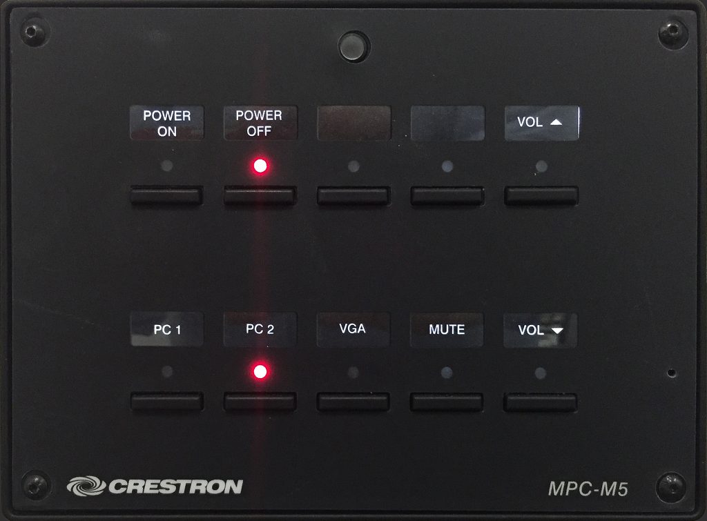
If you think about it, these tasks could be done with two rocker switches and rheostat, which can be purchased for $5 at an electronics store. However, amazingly, Crestron did not offer this simple solution in 2006-07 when we were installing our first iteration of classroom technologies. The interface at the right is what we ended up with for $150 per room (note that none of these switches are rocker switches, they are pushbuttons).
Let’s think through how long it would take to accomplish the three tasks with this interface.
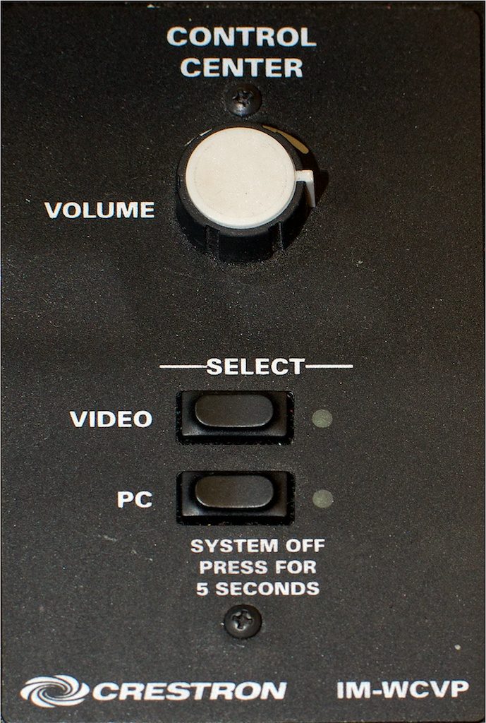
Task 1: Push the button marked PC and wait for the system to spool up (projectors take time to react, and the button has been known to get out of sync with the projector).
Task 2: You have to depend on an autoswitcher to work properly and flip the input to the laptop. You do this by plugging in the cable hanging from the side of the podium.
The video switch is only useful for VCRs and could not be repurposed as a laptop switch. Very few faculty have ever used VCRs with these systems. The problem with this part of the system is that if it fails to work the user has no idea why and there is nothing they can do to troubleshoot other than to assume that the “magic” failed to happen.
Task 3: The volume control may be the only intuitive part of this interface.
The lesson here is that the narrative interface presented to the user appeared to be simple. However, in actual practice, it turned out to be opaque and unintuitive for the tasks it was designed to facilitate.
The next most expensive option at the time (~2007) for $1500 more was to use the PC to control the system and run software called XPanel. $1500 per room is not a trivial amount when your project requires outfitting 150 rooms (that’s $225,000 more). As I wanted to make sure I outfitted all of my rooms uniformly, that was never a realistic option. Cost aside, this system is no more effective than the first in achieving our three tasks intuitively and elegantly.
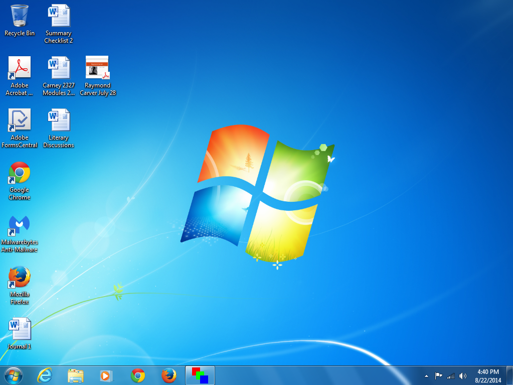
Let’s go back to the three tasks: In the first screenshot, which is the desktop when you wake up the computer, where is the software to make the system work? (Hint: The red-green-blue icon in the toolbar.)
The way to turn on the system is not entirely apparent. Now, lest you say: “Why don’t you put an icon on the desktop entitled ‘click here’?” We did. Everyone moved it around so you couldn’t find it most of the time.
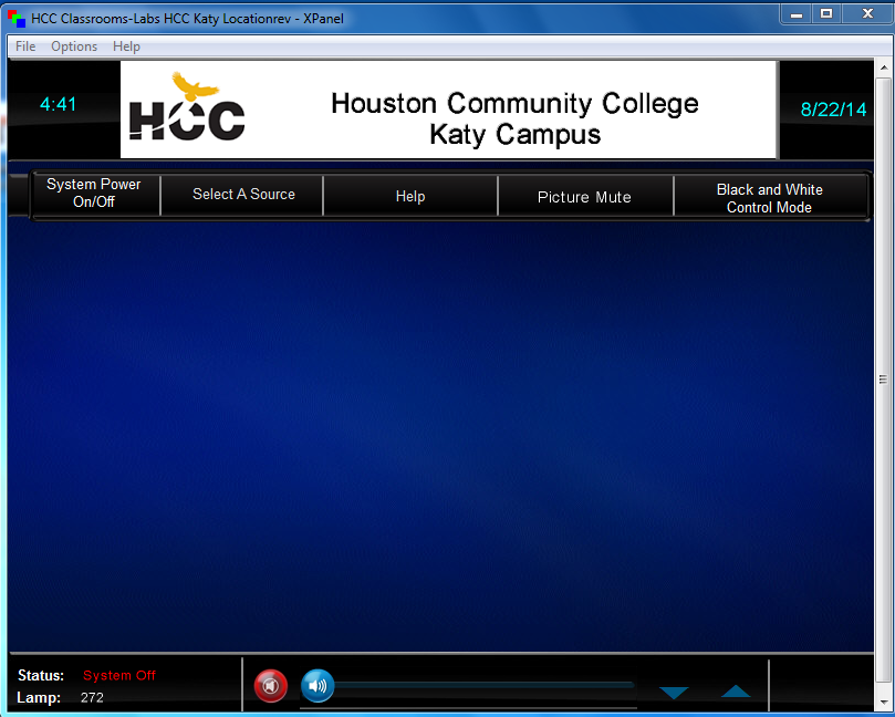
The system is better for switching once you have the software launched, as the second screenshot illustrates. However, there are some issues with buried menus and the volume control is less intuitive and somewhat fussy. At the end of the day this system requires as much training and support as the “simple” system (and costs a whole lot more to boot).
We get as many, if not more, support calls in the three rooms in which we installed these systems than in the more basic system. The lesson here is that higher cost doesn’t necessarily result in a better-designed system.
Our new systems offer a much simpler interface at only slightly more cost. At first glance, it looks low-tech, but that was the intent. In Make It So, designers Nathan Shedroff and Christopher Noessel note, “new interfaces are most understandable when they build on what users already know.” (p. 19).
The closest analogy for the multimedia classroom is probably the TV remote. From the user’s perspective this interface is merely a TV remote attached to the wall. The design is simple, clean and efficient. Everything is out front. The three tasks all have their own set(s) of hardware buttons. Once we got that right, the number of calls from these rooms plummeted, and the users were much more satisfied with their experience in the classroom.
The other thing well-executed systems do is increase the reliability of the rooms. They are very simple to build, maintain, and upgrade. These systems rely on the TV for most of the switching and therefore have very simple basic functionality on the back end. This makes them far more reliable and quicker to troubleshoot. However, they are also very expandable to encompass new technologies as they emerge and to add additional functionality the users might need without disrupting the basic narrative of the three tasks outlined above.
All of these factors make the narrative of the classroom much more about possibilities than limitations. Users can access the technology in an intuitive way. They can rely on it to work a high percentage of the time, and we can add on new features fairly simply, such as wireless instruction with iPads or other mobile devices as they become viable within the constraints of our network. This means that the faculty and students can focus on learning and innovating. In this way we are actually augmenting their experiences rather than hampering them.
Toward a Holistic Approach to Learning Space Design

In one of my favorite quotes from The Medium is the Message, Marshall McLuhan wrote, “The serious artist is the only person able to encounter technology with impunity, just because he is an expert aware of the changes in sense perception.” In other words, since artists fundamentally deal with bending a technology, whether it’s photography, paint, or the violin, they have to be acutely aware of the narrative that that technology produces.
Design operates on that same principle. Those who have a comprehensive sense of technology, design, and the narrative it creates, understand how easily that narrative is disrupted, the same way as a dropped note or misplaced brushstroke provokes a jarring departure from the vision that the artist is seeking to convey.
Classrooms have a narrative structure that most people don’t see. Technology is part of that narrative, but so are the furniture, whiteboards, and even the color of the walls. What story does this room tell?
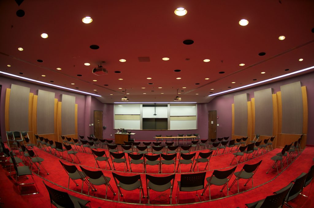
The narrative of this room is that the action is all in the front. The projection system and the whiteboard are there for the instructor’s use only, and all learning-focused interactions are within the instructor’s control. Your neighbors are largely irrelevant to the experience. The colors are interesting, but they take a secondary role to the dynamic of the space.
In short, the story here is: Look at me. I’m in front. I’m all that matters. Compare that to this:
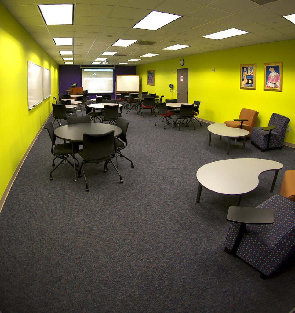
This room, one of our pilot learning spaces, is a bit more collaborative than the other room, but it’s not perfect. The focal point is still at the front of the room with the projection system, and some of the desks are oriented in that direction. It straddles the line between a truly collaborative setup and a lecture hall, and the result is confusing from a narrative standpoint. I’ve observed that this room is still used about 80% for lecture and 20% for collaboration. This is because when a new narrative is not obvious, the default position is usually to go back to what you know and that is your traditional teaching style. Lecture method is also safer because, as a teacher, you control the narrative of what is going on in the classroom, and in an unfamiliar environment, this becomes doubly attractive.
The University of Minnesota (UM) has taken narrative disruption a step further and created a truly collaborative classroom where it is hard to fall back on old habits.
Active Learning Classrooms (2012) from Andy Underwood-Bultmann on Vimeo.
We are building five of these classrooms into our new spaces, and I’m excited about the promise that they have in reshaping the narrative of teaching so that it’s expressly focused on collaboration. In comparison to our pilot learning space, the UM’s Active Learning design gives students ample outlets to create their own content and work through topics at a peer-to-peer level. Whether they are hooking up to displays connected to pods, or taking advantage of the whiteboards, they have assumed control of interactions within the classroom, and as such, have assumed ownership of their learning. The teacher is still an important facilitator in this process, but has to give up control in order to let the students create their own paths to learning goals.
Weaving in a principle from one of my previous posts, the appearance of technology in a room dictates the narrative of the learning space. A key design goal here was to minimize the impact of technology in the classroom while maximizing its ability to augment the learning experience of the students. By turning the focus away from the front of the room, and instead, to the space between students, the narrative of the classroom becomes clear: the room has become a place for teaching and learning rather than a place with flashy and sometimes working technologies.
One key component here was moving the computer away from the podium and onto the wall. In this way, the podium reverts to its original role of being a piece of furniture rather than a storage place for technology. This is critical because it creates an opportunity for the instructor to decide how he or she will place and use it; the podium is a key mechanism that determines the power narrative within the classroom. Note that UM’s Active Learning classroom doesn’t have a podium in the traditional sense.
The role of the podium in a classroom deeply affects the narrative of the classroom. It is a symbol of power and authority. Some faculty even go so far as to hide behind it. Others try to minimize its role within the room because it disrupts the active/collaborative narrative that they are trying to establish. Once the podium is freed of technology, it can be used in the way that makes the most sense. Personally, I want to get it out of the way. However, the one thing that I have done in these classrooms that has caused the most resistance amongst the faculty has been to replace the podium with a lightweight lectern. For some faculty, this was a step too far and serves as a reminder of how difficult it is to reshape the larger narrative of the role of the teacher in the classroom.
This also reinforces the central question of design: When a student or a faculty member enters a space, what does that space communicate to him or her about what kind of teaching and learning happens there? The subtlety of this narrative can easily be subverted by any number of bad design decisions. Remember that my goal has been to create an environment where technology augments instruction. I’ve succeeded when the teacher can control the narrative within the class more effectively than before, and we’ve given him or her an expanded set of tools not available in the pre-technology classroom.
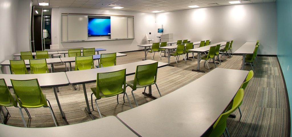
I do not think we have ever truly succeeded in this effort. For instance, can you spot the critical flaw in the room pictured? I have succeeded in my technology goals for the most part. The tech is off to the side. However, the alignment of the tables and chairs is rigid since you can’t move them easily. If everyone is facing the front that implies authority, and the lecture method of instruction is the natural consequence of this arrangement.
There are ways to mitigate this. In one department they’ve aligned the tables so that the students face each other rather than the front of the room. However, most do not do this and no one else I know of spontaneously rearranges this furniture. It’s too heavy and inflexible. If we are moving to a learner-centered constructivist narrative in our teaching and learning, this room does not communicate that message.
As you can see, many things can degrade the utility of a classroom if the design, technology, or other factors cloud the intended narrative. If we build learning spaces and technology around the old model of teaching, we should not be surprised if that is the kind of teaching that takes place. We must accept this reality if we stand any chance of reinventing the narrative of higher education going forward. Mindful design is key; a misplaced button, the wrong kind of furniture, or even the color of the walls can completely overshadow the message you are trying to send.
The last room illustrated was designed by a project manager, an architect, a furniture vendor, a technologist (me), an installation vendor, and a facilities manager. As such, it consists of the sum of its parts and nothing more. This is because it lacked a directorial vision centered on mindful design. Many of its elements failed to consider the desired behaviors of its users or the goal of learning because, other than myself, no one on that team had ever taught or had experimented with active learning strategies.
Creating modern learning spaces has to be a seamless collaboration of many entities with clear pedagogical goals in mind. As a member of the design team for two major campuses at Houston Community College, keeping this goal front and center is my full-time challenge and one that many of the other participants in the process do not consider a priority. Whether our next projects will achieve a truly mindful classroom design remains to be seen. I think we have yet to create a classroom that lives up to Steve Jobs’s design standards, but we’re getting closer.