I argued last week that one of the chief challenges in today’s world is a lack of transparency in our complex systems of information. However, even if we regulate to create transparency, we will need to develop tools for navigating the resultant deluge of new information.
We have those tools at hand, but most of us don’t use them. We miss opportunities, such as using the tools of mapmaking to help us learn. Instead, we persist in the learned behavior of following textual narrative pathways.
Learning and innovation are about perceiving information in new ways. We miss so much context when we never deviate from linear textual narratives.
Visualizing our ideas changes what we see. It allows us to cut through information soup and perceive what’s important in complex systems.
Humans excel at pattern recognition. “The speed of this kind of human visual processing contrasts dramatically with relatively slow and error-prone performance in strictly logical analysis (such as mathematics).” (MacEachren and Ganter, 1990, p. 67) Pattern recognition is the human strength that visualization unlocks.
I use maps to help my students grasp complex ideas and patterns as they navigate the political systems of Texas and the United States. We can use the same technique to navigate the complex information environment that we face today.
In Discovering Digital Humanity, I noted many groups found their voice because of the democratization of the network through technology. We heard voices that were ignored, relegated, or suppressed because they didn’t have to pass through the filters of “mass” media. However, that same technology democratized the spread of misinformation and deliberate manipulation of information streams.
All stories lack context. We have been conditioned through our use of text in education to accept linear, text-based narratives as being the most legitimate forms of communication. Challenges to that supremacy, such as comics or “hot” McLuhanesque media, have traditionally been characterized as less legitimate.
Text introduces a set of blinders. A careful author will list sources to describe the constellation of ideas that influenced his or her book or article. This is a good start, but it’s still looking outward from inside a linear narrative. The choices that the author makes are never linear, but once he commits them to text, they look that way.
In the last blog, I advocated for a high level of transparency as the first step toward gaining traction on the complex problems facing our societies, both inside and outside of technology. This is only the first step. Assuming for a moment that this strategy is effective, what we have done is unlock a whole new stack of information to add to the flood we are already confronted with.
Most of this information will be textual. A stack of papers or even PDF files is not transparent. Search tools are very useful for digital documents, but they also have limitations if you don’t know the words to search for. Adding AI assistants will help a lot, but visualizations of complex systems will reveal hidden patterns.
I have been using concept mapping for over a decade to decode my own thoughts. I also use it in brainstorming and teaching activities as a mechanism for discovering new ideas and fostering the exploration of ideas.
It is one thing to write down your thoughts, and it has great value, but I have pages of ideas and thoughts that are buried on my hard drive or a box somewhere. I have forgotten what was in many of them. I can’t even keep up with the stuff I’ve published half the time.
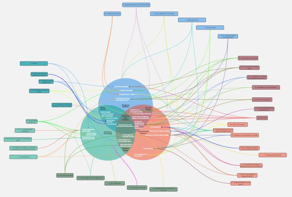
A map of the blogs and articles I’ve written since 2022
and how they relate to a model of thinking about technology that I developed last year.
There is a connective tissue to all of this, but I often take that for granted, because it is so implicit in the way I approach the world. However, I like to think that my thinking evolves. Understanding that evolution (and my shifting biases), while understanding common elements of my thinking, leads me to new ideas that do not follow a linear path.
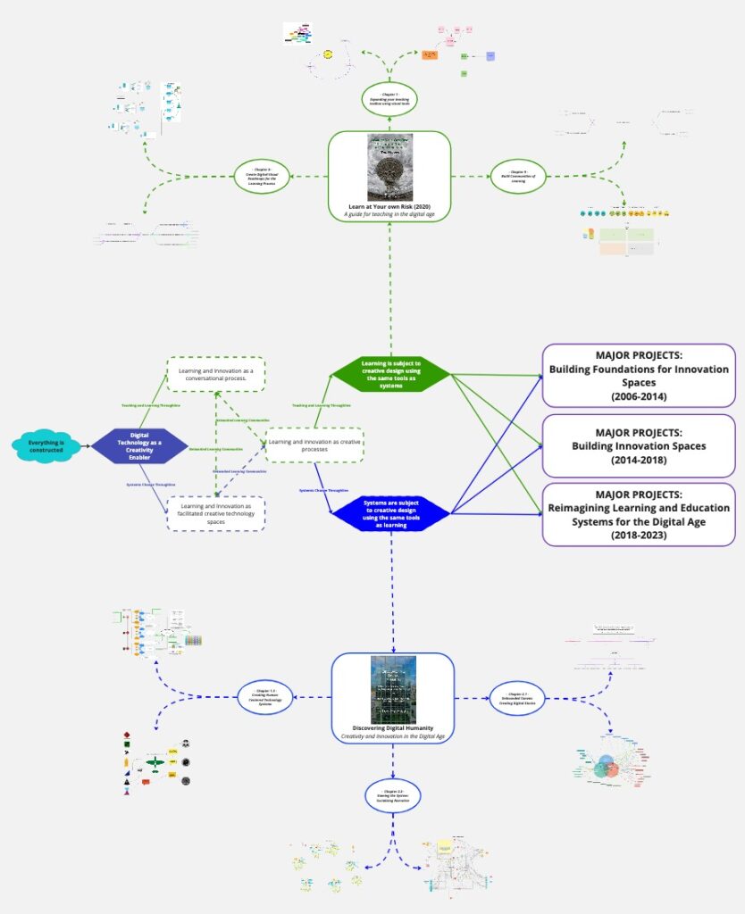
A recent attempt to connect and map my thinking
When I’m working with groups, I have the same problem but multiplied. Now I am mapping the collective evolution of multiple minds. As MacEachren and Ganter point out, this has deep neurocognitive roots, “[visualization] utilizes ‘preconscious’ processes to sort out patterns before conscious (i.e., logical) processing of the information is required.”
The technology to create these kinds of maps was limited to a small group who developed special talents and were blessed with a high level of artistic skill. My friend, Karina Branson, does amazing work capturing the thoughts of groups visually, but she possesses unique cognitive and dexterous talents.
For the last decade, however, we have had tools available to us that allow us to create our own cognitive maps. They are much more accessible.
We have moved away from the need to have technical proficiency with pen and ink to create graphics to perceive patterns of information.
Karina was one of the people who exposed me to Miro, which adds a collaborative element to concept mapping. Miro made my pivot to remote teaching possible because it opened so many possibilities for collaborative active learning and seeing.
![]()
A course map I created in Miro to help my students navigate my US Government class
The pandemic further narrowed our vision. Suddenly, we were communicating through digital pinholes, whether we were teaching classes or conducting business. Many bemoaned the loss of context and interactivity that this process of “Zoomification” created.
There is a power and spontaneity in having groups of humans gather in a physical space and toss ideas around. There are limitations to that model as well. We lose a lot in the process of debate. We leave good ideas on the table. Very little actionable material remains after the fact unless the brainstorming activity is well-designed and structured.
Tools like Miro, however, create a persistent object that users can access asynchronously. This is a power that I have been using for concept mapping my own ideas for years. Now groups can go back and look at where they were going yesterday or last week. They can also change it.
This is an incredibly useful teaching tool. But almost no one uses it.
However useful this tool is for mapping our own ideas, we can also use it to map complex systems and allow us to see outside narratives much more clearly. Imagine teaching US history, for instance, as an interlinked concept map rather than a linear narrative. You wouldn’t have to choose between competing narratives, you could see them all.
Teaching would be about finding the connections between narratives and understanding how context produces bias. Instead of a textbook, we would have a visual map to guide us.
These maps could also guide us in understanding complex systems, such as climate change or computational algorithms. For instance, to regulate AI and social media algorithms, companies could be forced to provide visual maps detailing their sources of information and how they connected them into creating text, graphics, or media streams.
As Erasmus wrote 500 years ago, “in the kingdom of the blind, the one in eyed man is king.” We are the kingdom of the blind.
The one-eyed men of today are those that control the narrative, but even they only see imperfectly. Visual mapping can open many eyes and democratize our stories in the process.
We have it in our power to restore our sight, but it will require tools we haven’t grasped yet. These tools are out there. With them, we can map the information we already have and use them to see the context and complexity that we may be missing.
Transparency means nothing without context. Maps provide context.
Next Up: The Promise of Layered Concept Mapping